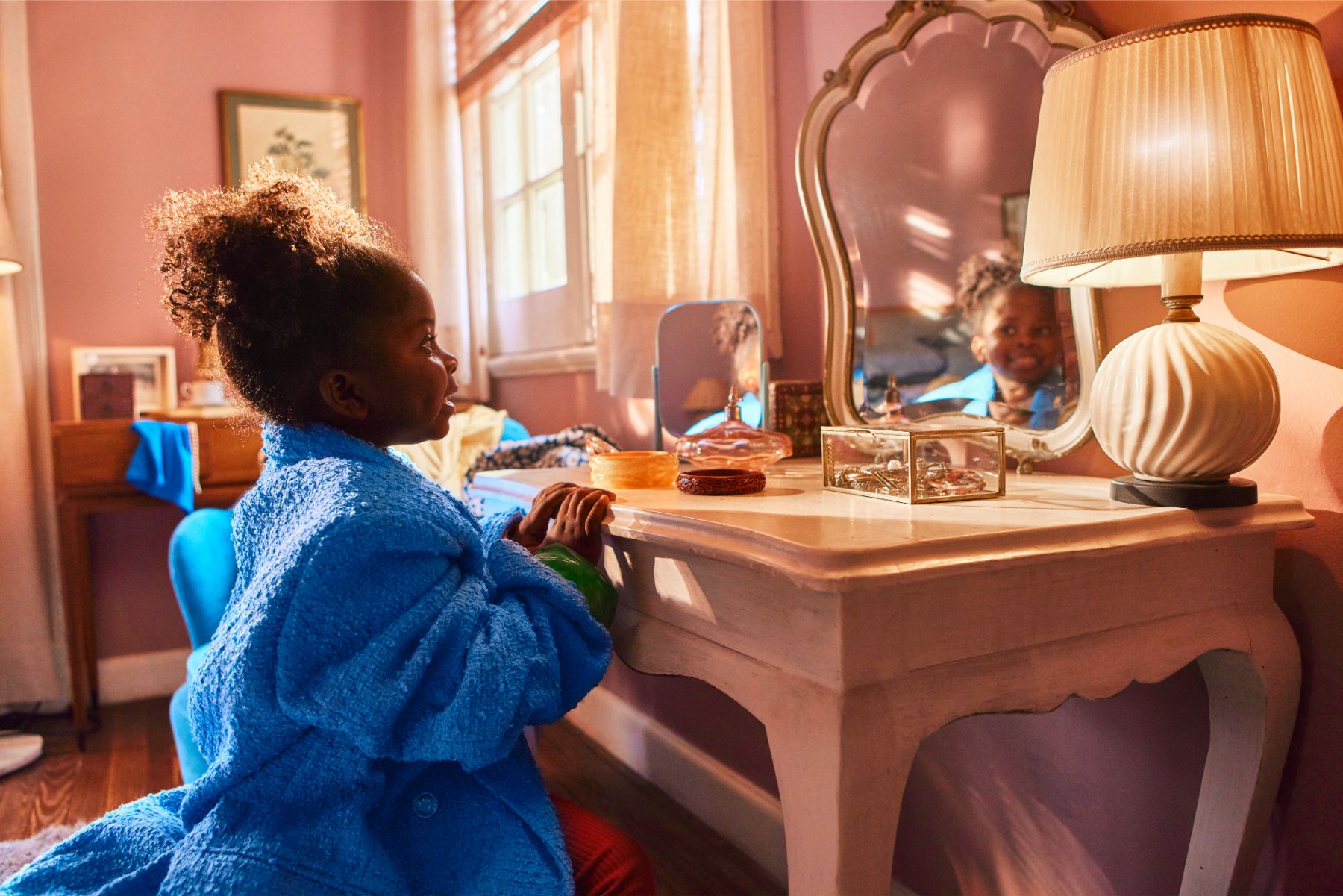
Hero, full width
This is the hero with full width


Hero, full width
This is the hero with full width
Here you have a left aligned heading section. As a size L, H1.
ButtonHere you have a left aligned heading section. As a size M, H2.
ButtonHere you have a left aligned heading section. As a size SX, H3.
ButtonHere you have a centered heading section. As a size L, H1.
ButtonHere you have a centered heading section. As a size M, H2.
ButtonHere you have a centered heading section. As a size SX, H3.
Button
This is a short content section. With a media on the left.
Lorem ipsum dolor sit amet consectetur adipiscing elit euismod tellus quam, fermentum nulla torquent inceptos vestibulum ullamcorper taciti.
This is a short content section. With a media on the left.
Lorem ipsum dolor sit amet consectetur adipiscing elit euismod tellus quam, fermentum nulla torquent inceptos vestibulum ullamcorper taciti.

This is a short content section. With a media on the right.
Lorem ipsum dolor sit amet consectetur adipiscing elit euismod tellus quam, fermentum nulla torquent inceptos vestibulum ullamcorper taciti.

This is a short content section. With a media on the right.
Lorem ipsum dolor sit amet consectetur adipiscing elit euismod tellus quam, fermentum nulla torquent inceptos vestibulum ullamcorper taciti.


Persons name
Persons name

Persons name
Persons name


it can show a small text
It can show a small text too.
It can show a small text too.
This is a long content section. Here you have different options.
Bold-text
Italic text
You can also make bullets:
And lists:
Lorem ipsum dolor sit amet consectetur adipiscing elit primis, potenti dictum nulla phasellus mus ornare donec ante quisque, sociis cras gravida inceptos integer imperdiet diam. Tempus arcu semper viverra cursus nibh eros est purus, mauris nam habitant phasellus leo montes blandit auctor,
Blocklists - Quote:
Persons name
Lorem ipsum dolor sit amet consectetur adipiscing elit primis, potenti dictum nulla phasellus mus ornare donec ante quisque, sociis cras gravida inceptos integer imperdiet diam. Tempus arcu semper viverra cursus nibh eros est purus, mauris nam habitant phasellus leo montes blandit auctor.
Lorem ipsum dolor sit amet consectetur adipiscing elit primis, potenti dictum nulla phasellus mus ornare donec ante quisque, sociis cras gravida inceptos integer imperdiet diam. Tempus arcu semper viverra cursus nibh eros est purus, mauris nam habitant phasellus leo montes blandit auctor.
Blocklists - media block:

Blocklists - media block, video:

Lorem ipsum dolor sit amet consectetur adipiscing elit primis, potenti dictum nulla phasellus mus ornare donec ante quisque, sociis cras gravida inceptos integer imperdiet diam. Tempus arcu semper viverra cursus nibh eros est purus, mauris nam habitant phasellus leo montes blandit auctor.
Blocklists - CTA block:

Image & text grid element 1.
This section can show a small text. It is often used to link into a page with more content/information

Image & text grid element 2.
This section can show a small text. It is often used to link into a page with more content/information

Image & text grid element 3.
This section can show a small text. It is often used to link into a page with more content/information

Image & text grid element 4.
This section can show a small text. It is often used to link into a page with more content/information

KIRKBI A/S
-Press Release
-26.03.2026

KIRKBI Investment Management
-Press Release
-11.03.2026

KIRKBI A/S
-Press Release
-03.02.2026